Common Ground
Common Ground is one of the leading urban design companies in New Zealand. Creating inspirational environments and imaginative urban planning design.
Identity Development
Print
Environment
Contour Lines
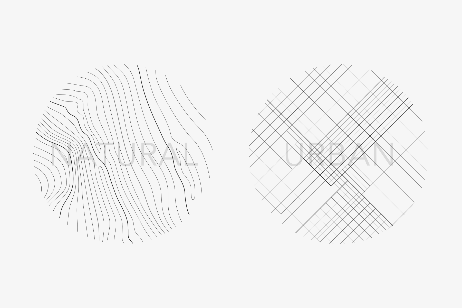
The pattern for Common Ground's visual language was inspired by contour maps. Contour lines help provide the topographical context for architectural plans. I applied this familiar styling, to both natural and urban patterns.
Visual Harmony
Using the symmetrical form of the 'G' as the starting point for Common Ground's pattern, the contour lines radiate harmoniously from the logo. Both the line spacing and form mirror the exact proportions of the logotype.
As the lines emanate out from the center, they start to ripple taking on the visual qualities of undulating forms of hills and valleys.
Balance
Telling the story of Common Ground's most revered values was an important component of the brief. Using the pattern with typography creates visual metaphors that speak to the heart of who Common Ground are.
Communications
The brochure and folder became the vehicle for expressing Common Ground's story. The pattern instinctually communicates both natural and urban environments. Also the quality of harmony, as the linework effortlessly morphs from organic shapes into man-made grids.


